10 Exit Intent Popup Examples That Boost Conversions
Last Updated: December 27, 2024 by Editorial Team | Reviewed by: James Dyson

Have you ever noticed how a well-timed exit intent popup can stop you in your tracks just before you leave a website?
That’s no accident – it’s a conversion tool that can turn abandoning visitors into customers.
In this article, we’ll discuss 10 exit intent popup examples that convert.
You’ll see how they work, why they work, and get the inside scoop on how to use the same tactics to capture lost sales, grow your email list, and keep visitors engaged on your website when it counts.
What are Exit Intent Popups?
Exit intent popups are smart, attention grabbing messages that show up when a user is about to leave, or exit, the website.
Unlike regular popups that can be disruptive of the user experience, exit intent popups only trigger when the user’s behavior indicates they are about to close the tab, click away or navigate to another page.
They’re a last ditch effort to grab the visitor’s attention and get them to take an action. This can be anything from buying products, signing up for a newsletter, downloading a resource, and more.
How do exit intent popups work?
The exit intent technology uses advanced algorithms that track mouse movements and user behavior in real-time.
When a user’s cursor moves towards the browser’s address bar, browser window back button, or close button, the algorithm detects this as a sign the user is about to leave.
This triggers the popup at the exact moment to give the business one last chance to re-engage the user.
Example of key user behaviors that are often tracked for this purpose include:
All together, this ensures that the exit intent popups are kept relevant, accurately timed, and non-intrusive.

Get More Leads & Sales in WordPress using Conversion Optimized Funnels
Watch our exclusive demo now to learn how to build high-converting landing pages & funnels in WordPress.
Why Exit Intent Popups Boost Conversions
Exit intent popups go beyond being a last resort to keep people on your site—they are a strategic tool that directly impacts conversion rates by addressing user hesitation at the right moment.
Here’s how they help to boost more conversions.
1. Reduce Cart Abandonment
One of the best uses of exit intent popup examples is to reduce cart abandonment which is a major problem for e-commerce sites.
When someone is about to leave without buying, an exit intent popup can offer a timely incentive—like a discount code, free shipping or a limited time offer—that will nudge them to complete their purchase.
By addressing common pain points like unexpected costs or indecision, these popups will turn browsers into buyers.
2. Capture Leads Before They Leave
exit intent popups are also great for lead generation. Whether it’s subscribing to a newsletter, downloading a free guide or signing up for a free trial, these popups can turn passive visitors into leads.
By offering something of value in exchange for contact information, businesses can continue to nurture relationships with potential customers long after their first visit and increase the chances of future conversions.
3. Offer Last-Minute Deals to Hesitant Customers
Hesitation means a potential customer just needs a little push to convert and exit intent popups give them that gentle nudge.
This can be in the form of an exclusive discount, a flash sale alert or even a reminder of the benefits of completing a purchase, re-engaging visitors at the point of exit.
This strategy plays on urgency and exclusivity, making visitors feel they are getting a special deal they would miss out on if they left the site.
Key Elements of an Effective exit intent Popup
To create a high converting exit intent popup you need to focus on 3 key elements: attention, value, and action.
Here are the elements to focus on so you can ace all three.
1. Compelling Offer
The heart of any good exit intent popup is an offer that gives immediate value to the user.
This could be a discount, free shipping, a download, or an exclusive deal that speaks directly to the user’s needs.
The offer needs to be relevant and enticing enough to stop the user from leaving and make them reconsider.
2. Clear Call-to-Action (CTA)
A clear call-to-action is key to guiding the user to the desired action.
The CTA should be short, direct and action based, using phrases like “Get Your Discount”, “Claim Your Free Guide” or “Unlock Your Offer Now”.
The language should create a sense of urgency so the user doesn’t hesitate. Make sure the CTA button is prominent and stands out from the rest of the popup.
3. Simple Design
A clean, simple design with minimal text means the message is clear and the offer stands out.
It’s also a good idea to use contrasting colors for the CTA button and keep the popup layout simple.
Don’t overwhelm the user with too much information. Instead, focus on a simple and compelling message that matches your brand.
4. Perfect Timing and Triggering
Timing is everything with exit intent popups.
The popup should trigger when the user shows signs of leaving, such as moving the cursor toward the browser’s close button or navigating away from the page.
The delay between the user’s intent to exit and the popup appearing should be minimal so it feels natural and not intrusive.
Always keep in mind that the difference between recovering a sale or losing the visitor entirely is timing.
5. Mobile Optimization
As of 2024, there are 187.5 million active mobile shoppers in the U.S. With more and more users browsing on mobile devices, mobile exit intent popups are a must.
Mobile popups need to be responsive, easy to close, and the right size for smaller screens.
Avoid full screen popups that feel intrusive. Instead, go for slide-in or smaller popups that grab attention without interrupting the mobile user experience.
Also, make sure the CTA buttons are big enough to be clickable on touch screens.
10 Exit Intent Popup Examples That Boost Conversions
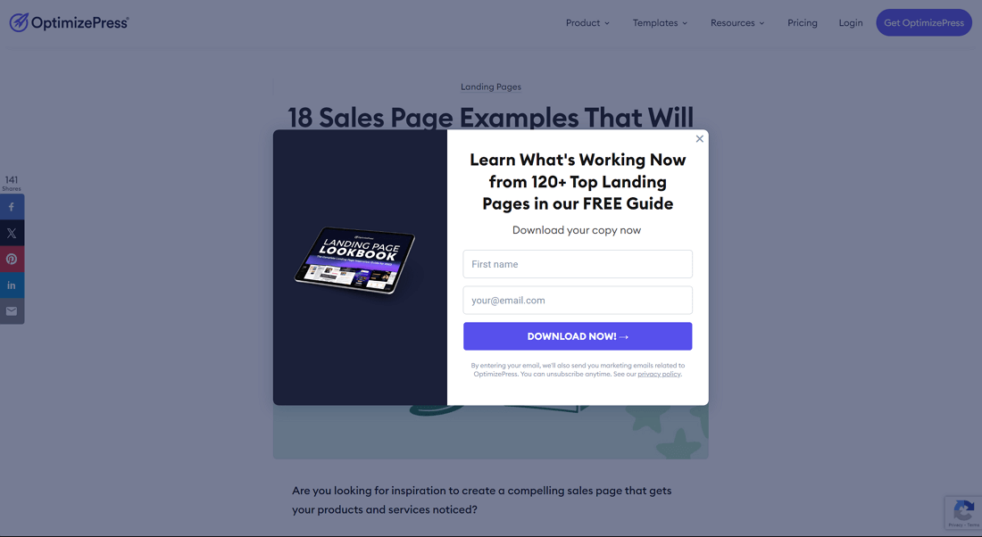
OptimizePress is a popular platform for building landing pages and sales funnels especially among marketers and business owners. On the blog post, “18 Sales Page Examples That Will Transform Your Business,” an exit intent popup pops up just as the user is about to leave the page.
Exit Intent Popup Examples Objective:
The purpose of OptimizePress’s exit intent popup example is to capture emails by offering value to users who are about to bounce. As the user tries to leave the page the exit intent popup appears and offers a free guide with 120+ Top Landing Pages.
This addresses the users intent to exit and turning a lost opportunity into a lead capture by offering helpful information for anyone who wants to improve their landing page game.
Key Points:
Why It Works:
It addresses user objections – like the feeling they don’t have time to engage further – by offering something quick and easy to get (a downloadable guide). FOMO is introduced subtly by the idea that the user is about to miss out on a chance to improve their landing pages with expert insights.
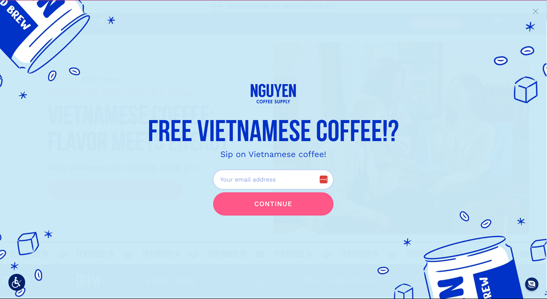
Nguyen Coffee Supply is a brand dedicated to bringing authentic Vietnamese coffee to global consumers. With a focus on direct trade and sustainably sourced beans, the company focuses on growing the global reputation of Vietnamese coffee.
Exit Intent Popup Objective:
Nguyen Coffee Supply’s exit intent popup is to get visitor’s email addresses and offer a high value incentive – a free sample of their Vietnamese coffee. The popup is to drive future sales by allowing visitors to try the product and grow their email list for ongoing marketing.
Key Points:
Why It Works:
The simplicity and clarity of the offer gets rid of any confusion plus the bold copy and CTA creates urgency and excitement. By offering the chance to try the product without buying, the popup addresses the common objection of not wanting to buy before trying, reducing the risk for the user.
3. Tim Ferriss
Tim Ferriss is a best selling author, podcaster and entrepreneur in the personal development, productivity and lifestyle design space.

Exit Intent Popup Objective:
The goal of Tim Ferriss’ exit intent popup is to capture customer’s email addresses. This popup keeps visitors engaged by offering a free eBook called “17 Questions That Changed My Life”. By offering something of value, the popup turns passive users into active subscribers so Ferriss can continue to engage with his audience via email.
Key Points:
Why It Works:
This popup works because it taps into curiosity and offers a high value, exclusive resource for free, to get the user’s email. The simplicity of the design and the concise bold copy make it easy to understand the value and the CTA is well placed to encourage action.
4. West Elm
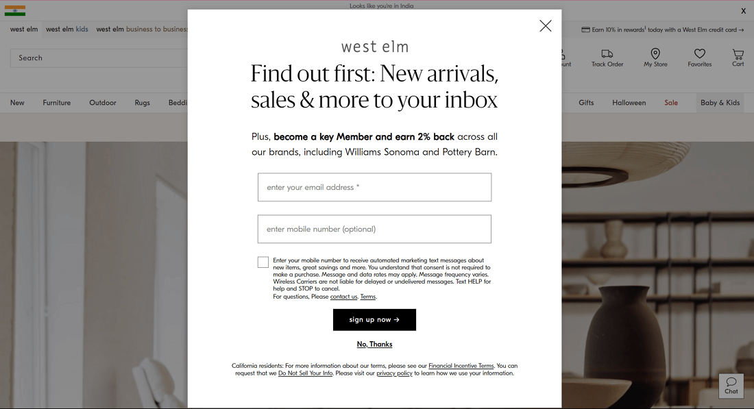
West Elm is a home furnishings store with modern designs and a focus on sustainability. Their online store has furniture, decor and home accessories for style lovers.
Exit Intent Popup Objective:
West Elm’s exit intent popup is to get more people to join their Key Member Program. This program gives shoppers 2% back on all purchases across West Elm and partner brands. By offering benefits tied to future purchases, it addresses the user’s hesitation and gives them a reason to stay.
Key Points:
Why It Works:
For visitors who are unsure about buying, the 2% back as a Key Member reduces the risk and adds a financial incentive to stay engaged with the brand. The combination of a good offer, minimalist design and timing helps West Elm get leads and encourage future purchases before the user leaves.
General Assembly is a global education company that offers coding bootcamps and professional development courses in tech, design, business and data. Their website has a beautifully designed exit intent popup on various course and bootcamp pages.

Exit Intent Popup Examples Objective:
The main goal of General Assembly’s exit intent popup is to capture contact information from users who aren’t ready to sign up for a course but are interested in learning more. This way, General Assembly can continue to nurture those leads and provide them with resources to help them make a decision later.
Key Points:
Why It Works:
General Assembly’s exit intent popup targets users who are hesitant or undecided, giving them an easy way to stay informed without making a decision right away. By offering a low-commitment option to subscribe for more information, it takes the pressure off the user and keeps them in the sales funnel.
Madsen Cycles are cargo bike specialists for families and utility use. Their website is a go to for eco conscious consumers looking for durable high capacity bikes.

Exit Intent Popup Objective:
The main purpose of the popup is to get email addresses by offering a $100 coupon code on a future purchase plus a resource like a buyers guide.
This is for users who are considering a purchase but haven’t yet committed or need more information. The popup helps the fence sitters by offering a financial incentive and educational content to help them make a decision.
Key Points:
Why It Works:
The popup combines FOMO (fear of missing out) with practical benefits. By addressing the user’s objections (price and uncertainty), the popup increases the chances of the user subscribing and eventually buying.
7. Theoodie
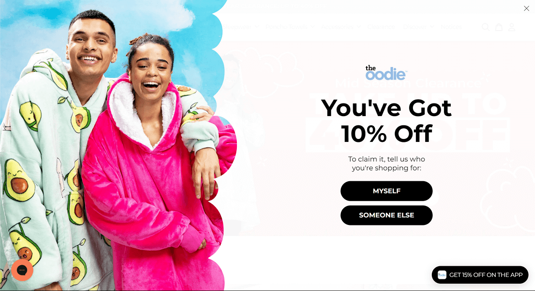
The Oodie is a popular brand known for its ultra-comfortable, oversized hooded blankets that provide a cozy lounging experience.
Exit Intent Popup Objective:
The Oodie’s exit intent popup aim is to convert by offering discounts and encouraging email sign-ups.The Oodie addresses the users hesitation with a 10% discount and an extra 15% off when they download their app to keep them engaged with the brand.
Key Points:
Why It Works:
The Oodie’s exit intent popup works because it combines personalization with an offer that’s hard to resist. By asking the user who they are shopping for (themselves or someone else) the popup personalizes the shopping experience and gets valuable insights into their customer base.
8. PRESS
PRESS is a well-known brand that offers cold-pressed juices, healthy meal plans, and nutritional products.
Exit Intent Popup Objective:
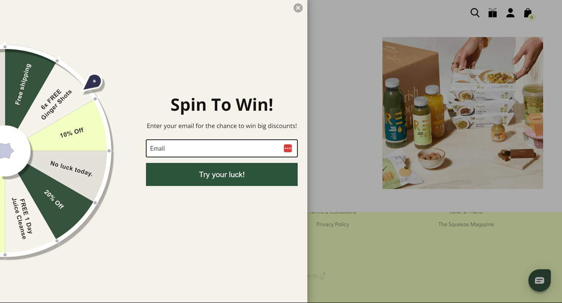
The purpose of the PRESS London exit intent popup is to get emails and drive immediate sales with rewards. It converts hesitant shoppers into email subscribers by offering them an interactive “spin-to-win” feature and keeps them engaged as they are about to leave.
Key Points:
Why It Works:
PRESS’s exit intent popup works because of the gamification and interactive element. Spinning the wheel to win creates excitement and FOMO as the user feels like they might miss out on a good deal if they don’t try. The playful design and reward system creates a positive emotional response and gets the user to convert.
9. Jansport
JanSport is a big and well renowned brand for backpacks and gear for students and outdoor enthusiasts.
Exit Intent Popup Objective:
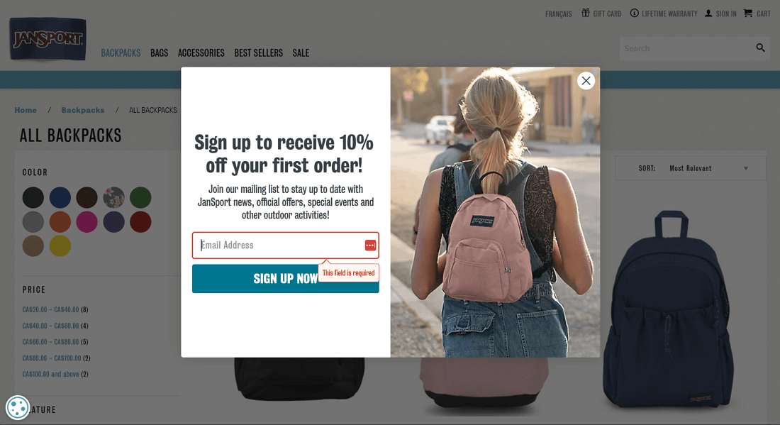
JanSport’s exit intent popup is to collect email addresses and build their list. As users browse product pages without adding anything to cart, the popup offers 10% off for their email address.
The offer is to convert hesitant visitors into subscribers who may later be nurtured into a sale.
Key Points:
Why It Works:
By offering a discount, JanSport addresses the user’s hesitation to buy without being too pushy. It creates FOMO (fear of missing out) while keeping the user experience smooth and frictionless which leads to more email signups and potential future conversions.
10. Kiss My Keto
Kiss My Keto is a brand that specializes in keto-friendly products, catering to people following a ketogenic diet. Their products include snacks, supplements, and other essentials for maintaining a low-carb, high-fat lifestyle.
Exit Intent Popup Example Objective:
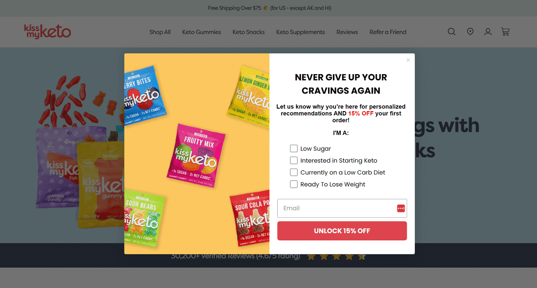
The goal of the Kiss My Keto exit intent popup is to capture emails and offer personalized product recommendations with a 15% discount. It addresses the user’s hesitation to buy by offering a discount based on their needs so the brand can capture leads and conversions right before the user leaves.
Key Points:
Why It Works:
This exit intent popup works because it’s personalized, engaging, and tailored to keto dieters. The option to choose from 4 categories based on their dietary goals adds an extra layer of customization so Kiss My Keto can better understand their audience and the user feels like their needs are being addressed directly.
Key takeaways for your Exit Intent Popup Examples
These exit intent popup examples showcase how popups are a powerful tool to stop cart abandonment, collect email leads and drive conversions as a user is about to leave a website. Here are the key takeaways from analyzing various exit intent popup examples:
Now that you know the psychology behind exit intent popup examples lies in addressing user hesitation and offering them something valuable before they leave, it’s your turn to create exit intent popups that succeed!

Get More Leads & Sales in WordPress using Conversion Optimized Funnels
Watch our exclusive demo now to learn how to build high-converting landing pages & funnels in WordPress.
Ready to experience the OptimizePress difference?
OptimizePress is the leading funnel builder and landing page builder that is affordable and designed for solopreneurs and founders who need to get their pages live fast.
14 day money back guarantee


