9 Creative Landing Pages to Inspire Your Next Campaign

by Joanna Taylor
Last Updated: September 28, 2023

Great landing page design, coupled with effective ad campaigns, can generate amazing results for your site.
This might be sales of your product, downloads for your software, or subscribers downloading your lead magnet.
But poor page design can make any advertising campaign too expensive.
While there are plenty of landing page templates out there, it pays to customize designs according to the campaign you’re running.
Below, you can see 9 creative landing page ideas to help inspire your next campaign.
What Are Landing Pages?
Landing pages are pages that visitors are presented with after clicking an ad or a link from another site.
They are standalone pages typically used to direct traffic from specific marketing campaigns. You may have a landing page for your email marketing campaign and another specifically for a social media campaign promoting your latest offer.
While the home page of a site acts as a portal to the rest of your web pages, a landing page is used specifically to convert visitors, whether that means making sales, collecting email address information, or any other type of conversion.
Below, you will find 9 creative landing page ideas to give you some design inspiration for your own website.
Whilst the examples included below might not all apply to your niche, take some inspiration from the ideas here and see what works for your own landing pages and ad campaigns.
Also Read: What is a Landing Page?
Creative Landing Page Examples
1. Wag!
Wag! is a website that connects owners with dog walkers and pet sitters. To be successful, it needs a large database of pet professionals and regularly runs campaigns to attract new dog walkers.

The company’s landing page design is direct and to the point.
The headline states exactly who the page is aimed at and the subheadline mentions the 400k walkers and sitters that are already part of the community.
This brings perceived credence to the service. This is further backed up by photos of dog walkers that are currently using Wag!
Wag!’s aim is to get pet professionals to fill out a short form and submit their email address. The form they use is above the fold so very prominent and is simple enough that it shouldn’t put any potential members off.
Considering a lot of walkers and pet sitters will be more likely to use cellphones and mobile devices than desktops, the addition of a QR code makes it even simpler.
The rest of the page offers benefits and features as well as a couple of testimonials from existing users, building trust.
The profiles even link to videos, which bring even greater trust. The colors are well branded with links, play buttons, and some of the background using the Wag! Green.
The landing page design is uncluttered and uses negative space. While there are a couple of links to relevant pages, these shouldn’t detract from the main CTA at the top of the page and the liberal use of personal photos paints a picture of a network full of content dog walkers.
2. Bills
Bills.com is part of Freedom Debt Relief, which offers debt relief programs and solutions including credit card debt relief, which this landing page targets. It’s not a particularly exciting topic, but it is an emotive one.

The landing page has an incredibly simple design, featuring a phone number, slider, and a CTA button. There are a couple of additional questions that users need to answer before being asked to provide contact details, but these aren’t immediately accessible.
The slider offers a degree of interactivity, and the proceeding questions are simple button clicks. The interactivity will draw users in, and there aren’t too many follow-up questions or details required, so the whole process shouldn’t put users off.
The web design is very simple with a gray background, white form background, and a red button. As well as being a bright color that grabs the attention, red is an emotive color that instils a sense of urgency and encourages users to submit their details quickly.
3. Slack

Slack is a messaging app, but it offers much more than messaging features: something that the publisher wants to highlight to its potential users. This is evident in the company’s landing page design.
The primary aim of the landing page is to have users click through and sign up for Slack Pro and they are offering 50% off the first three months of membership.
Above the fold, there’s an eye catching headline with a simple screenshot to the side. There are a couple of feature bullet points, followed by the CTA. When users click on the button, they can provide an email address or use Google or Apple login details, so while there is an extra step, it is still a painless procedure.
The CTA highlights the offer of 50% off subscription prices and uses direct wording. The purple color of the button not only stands out against the background but it is in keeping with the page design.
Further down the page, there is a table comparing the features of Slack’s Free and Pro versions. It’s simple to follow and does a good job of showing the benefits of signing up for paid membership.
Below this is another link for those that need more complex features for their business before a list of features and benefits. There are also logos of companies that use Slack.
While this doesn’t necessarily mean they like the app, the logos’ inclusion appear as recommendations and include some big names, which will attract businesses that aspire to the levels of success enjoyed by Airbnb, Spotify, and the rest.
4. Lyft

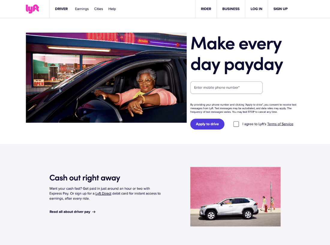
Lyft is a ride share scheme similar to Uber. They need both drivers and riders, and have landing pages and marketing campaigns for both sides of the equation.
Lyft has its work cut out trying to compete with Uber. The aim of this landing page is to have people apply to become Lyft drivers to increase the size of their fleet and reach of their service.
As soon as the landing page opens, visitors are presented with a picture of a Lyft driver, a headline, and a simple one-field form. The photo of the driver clearly indicates who Lyft’s target audience is and the short headline highlights the main benefit of the service – getting paid.
The design is simple and while the form and CTA button use minimal color, the photo does a good job of adding interest.
For users that scroll beyond the fold, the next headline offers another major benefit of the service, followed by another. The web design continues to use photos for color and, at the bottom of the page, there is a driver testimonial to build confidence.
The simplicity of the design is backed up nicely with short, concise web page content and the personable nature of the images is compelling.
5. DoorDash

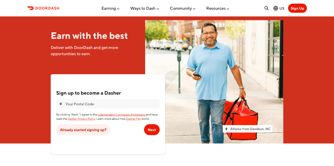
DoorDash is a food delivery service competing in the same space as Uber Eats, Deliveroo, and others. Like Lyft, they feature marketing campaigns to attract new drivers, or Dashers as the company refers to them.
DoorDash’s landing page design is well branded with a red background and the same color is used in button design and for links and other elements on the page.
The main form is a single field, where users add their zip code and click to start the sign-up procedure.Adding a zip code allows the user to see whether DoorDash is available in their region.
There’s also a button for those that have previously started the signup process but stopped part way through registration, for whatever reason, which can help combat high bounce rates or form abandonment rates.
As well as a list of features and benefits of becoming a Dasher, the landing page also has a section that shows the potential earnings of their drivers, which is a handy and alluring touch.
The page makes good use of negative space and as well as the DoorDash red, it also uses a muted pink version of the brand color with pictures of Dashers for aspiration.
As well as a clean design, the landing page makes good use of concise copy that shows off the benefits of signing up.
Showing potential earnings and highlighting the benefits that the company offers its drivers makes this a creative landing page that converts.
6. Airbnb

With Airbnb, property owners can rent out their homes and holiday homes, potentially earning some extra cash.
One of the biggest questions that potential landlords have is how much they can earn. Obviously, this figure can change considerably from one property to the next, and even according to time of year.
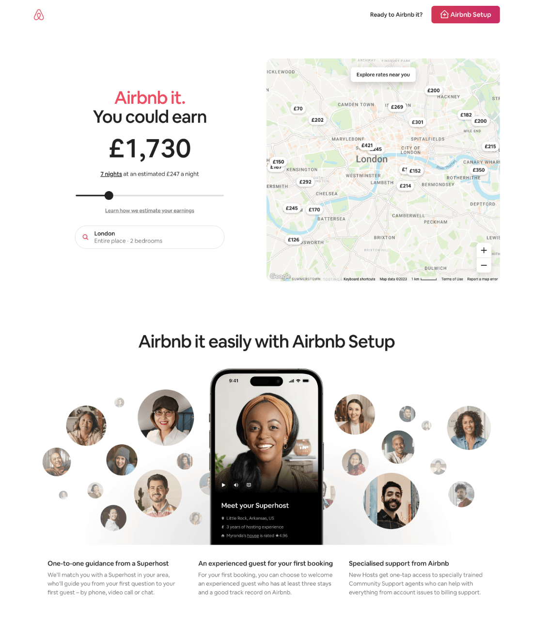
Airbnb’s landing page design starts by answering this pain point with a simple and interactive tool.
The page gathers location data from your browser and then looks at the typical earnings of other properties in the same area before providing an estimate of how much a property could earn if rented out for seven nights.
Users don’t need to do anything to be presented with this information, but it is only a rough guide.
A map to the side shows local information and earnings for other properties in the area, which also shows that local landlords are using the Airbnb service.
There’s also a button to click so the user can add more specific location data to be given a more accurate price.
Below the earnings calculator is a collection of landlord’s faces, which helps instill trust and shows the popularity of the service. There are benefits of using the service and a table that shows what Airbnb offers compared to its unnamed competitors.
The landing page is clearly setup as a dedicated landing page. The usual header menu and details aren’t there to distract from the main CTA of the page.
7. Filecamp

Filecamp is a digital asset management software suite that offers a free 30-day trial. Users don’t need to add a payment method to take advantage of the free trial, and Filecamp boasts a lot of high profile customers.
The landing page copy is designed to attract new conversions for its free trial offer. The header has a blued photograph, against which the white writing stands out well, and the green button is clearly visible. It also sticks with the company’s branding.
The headline clearly states what Filecamp is, while the subheadline reiterates what the software does and its three biggest benefits: it’s easy to use, can be custom branded, and offers cloud-based storage.
The button text includes the word free, which is always a motivator, and the white next to the button is in a handwritten font so it stands out and gives a personal feel, like being given a business card with a handwritten personal note.
Continue down the landing page design and you can see a screenshot of the software in action, showing off its intuitive design.
There’s also a row of features and then a massive cloud of companies that use the software, which brings credibility to Filecamp’s offer. The page has also had the header navigation removed, which helps concentrate the visitors’ attention on the offer at hand.
8. Believe Loans

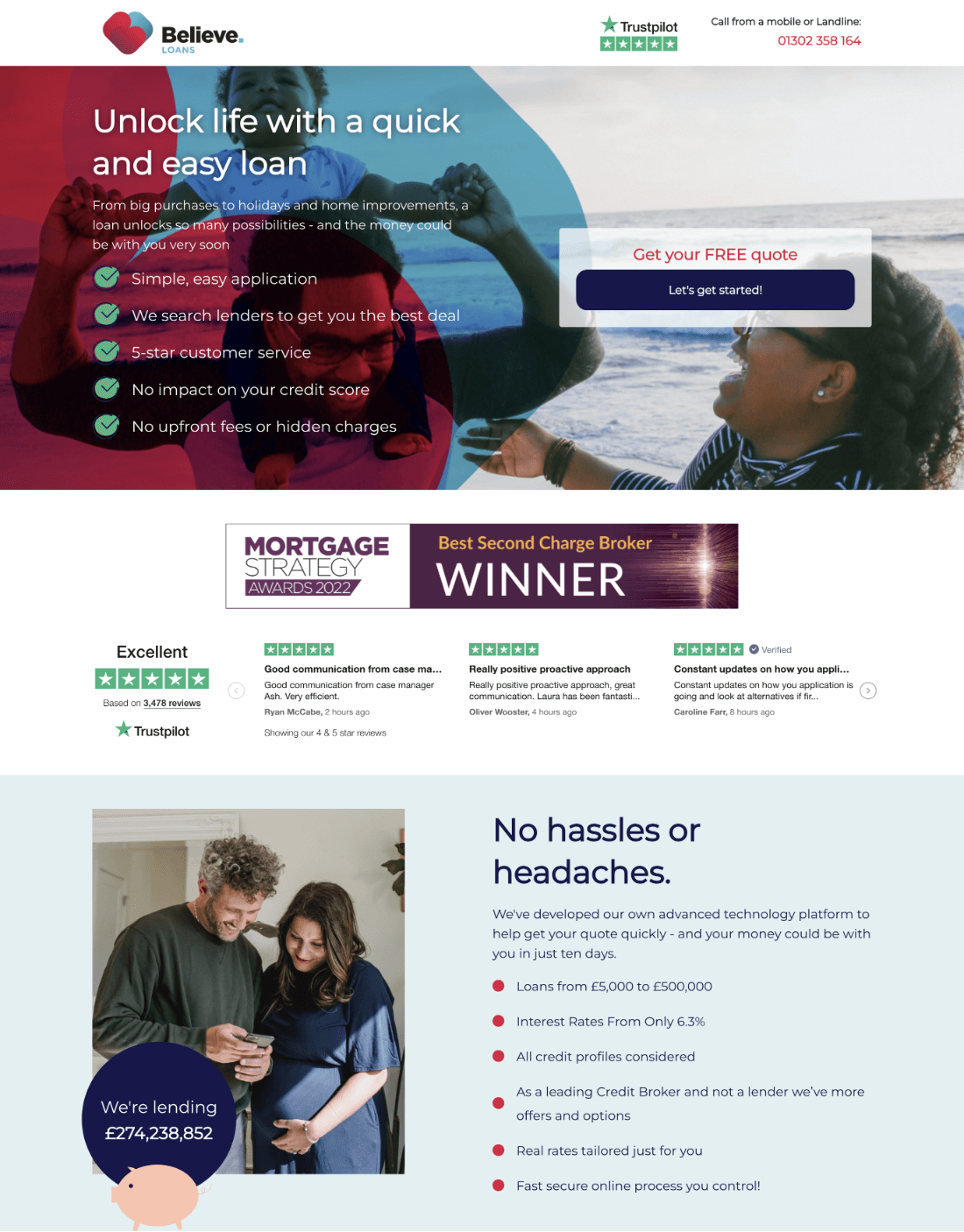
Believe Loans is a UK-based loan company and its homepage basically acts as a landing page, with most of its traffic likely coming from paid ads and sponsored ads. The aim of the landing page is to convince users to request a free quote.
The page’s use as a home page means that it does contain a lot of information. It starts with an aspirational photo, with the benefits of using Believe Loans overlaid over the top.
The bullet points do a good job of identifying customer pain points and combating them – the application is easy, custom service is good, there are no hidden charges, and an application doesn’t negatively impact credit score.
Next is a banner displaying the company’s Mortgage Strategy Awards award along with customer testimonials. Then, visitors are presented with specific details regarding the loans, including limits and rates.
There is also a breakdown of the process: with only three steps given, this makes it appear as though the process is quick and simple. The page uses red and blue throughout, which matches the branding.
9. Shopify

Shopify is an all-in-one commerce platform that can be used to assist with everything from listing products to taking payments. It can also integrate a host of other apps and platforms to enhance its offering.
Shopify offers a 3-day free trial and three months for a dollar a month, and getting people to sign up for this offer is the main aim of their landing page.
Shopify’s green branding is used throughout the landing page, which starts with a headline outlining the free trial and subheadline that gives the specifics of the deal.
Then there is a single field and a CTA button that make up the really simple submission form. Three of the main benefits are highlighted, followed by logos belonging to some of the commerce companies that use Shopify.
To build trust, there’s a personal customer testimonial and then another opportunity to fill in the simple form for those that have been persuaded by that testimonial. Apart from a few collapsible FAQs, that’s pretty much all of the content on the landing page.
Shopify has also removed the header menu and navigation sections from its main home page design. It is simple but it’s also clear and as it is backed by a really good offer, it is likely to convert.
How To Measure Landing Page Success
To measure how successful a landing page is, you need to first determine your aim. Types of conversion include:
- Purchases
- Email sign ups
- App downloads
- Completing a contact form
- Using an online tool
Using the number of visitors that arrive on the landing page, you can then determine the conversion rate by dividing the number of visitors by the number of conversions.
So, if you had 100 visitors and 3 conversions, you would get a conversion rate of 3%.
If you are paying for an advertising campaign to drive visitors to that landing page, you can also calculate how much you are paying per conversion and ensure its viability.
3 Tips for Landing Page Design
1. Be Creative
There are lots of ways to create high converting landing pages. Some pages benefit from the simplicity of having a single headline and a simple form. Others use photos, testimonials, logos, and other elements.
Don’t be afraid to be creative with landing pages. They are separate from the rest of your site, so if a design fails, it shouldn’t negatively impact your main site’s performance.
2. Don’t Dilute Your Conversions
No matter how creative a landing page is, it should have a single clear goal. Whether you want to sell a product or services or increase lead generation, you shouldn’t detract from this goal by adding too many links to other pages or other services you offer.
3. Test Changes
Always look for ways to improve and test any changes you make.
Even small changes can have a big impact on your conversion rate, so something like changing the color of your CTA to red, instead of blue, could turn a struggling ad campaign into a highly effective one.
Test changes, ideally through A/B split testing, but at the very least by comparing results against one another.
Conclusion
Use the 9 ideas above for landing page inspiration. Track your conversion results and don’t be afraid to make changes even if your campaign is going well.
You can always revert to your original idea, and a simple change could yield even better results.
Build Landing Pages That Convert with our Inspiration Lookbook...
Unlock Higher Conversion Rates: Get Access to 120+ Landing Page Swipes from Creators, Digital Marketers and Experts in our latest Landing Page Lookbook


Build Landing Pages That Convert with our Inspiration Lookbook
Get Access to 120+ Landing Page Swipes from Creators, Digital Marketers and Experts + insights and steps to boost your landing page conversions.


