10 One Page Website Examples to Inspire You
Last Updated: September 9, 2024 by Editorial Team | Reviewed by: James Dyson

Have you ever wondered how a single page can tell a complete story?
That's the magic of one page websites. They are a masterclass in simplicity, blending form and function to deliver powerful messages without overwhelming the user.
In this article, we'll explore 10 one page website examples that inspire creativity and demonstrate the art of minimalistic web design.
Whether you're looking to create your own or simply appreciate the beauty of concise content, these examples are sure to spark your inspiration for your business.
What is a One Page Website?
A one page website is a web design format where all the content is displayed on a single, continuous page.
Instead of navigating through multiple pages, visitors scroll through different sections to find information.
This streamlined design focuses on delivering key messages and content quickly and efficiently, often using bold visuals and concise text.
It's a great choice for businesses or projects that want to make a strong, straightforward impression.
Why Choose a One Page Design
Choosing a one page landing page design comes with several benefits. Here are some of the reasons why you should consider a single page website design for your site:
Benefits of One Page Websites
One page websites offer many benefits that make them a good choice for businesses, creatives and anyone looking to make a memorable impression online.
Here are the main benefits:

Learn What's Working Now from 120+ Top Landing Pages in our FREE Guide
Get Access to 120+ Landing Page Swipes from Creators, Digital Marketers and Experts + insights and steps to boost your landing page conversions.
10 One Page Website Examples
Now that we've explored the advantages of one page websites, let's dive into some real-world one page website examples that showcase the creativity and effectiveness of this design approach.
Cook Collective is a prime example of a one page website done right.
The moment you land on the site, you're greeted with bold typography and a striking tagline: “Shared kitchen by food industry people, for food industry people.”
This clear, concise statement immediately conveys the brand's purpose and establishes the tone for the entire page. It's a perfect introduction that tells visitors exactly what to expect and draws them in from the start.
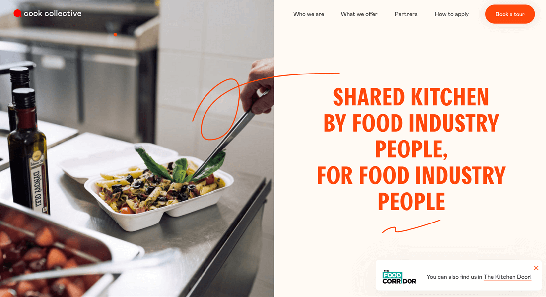
The one page website has a sticky menu at the top which allows you to jump to different parts of the page without losing your place. This is a big plus for a one page website as it makes navigation smooth and efficient.
Also, The Cook Collective uses a simple colour palette of orange and black which keeps it all cohesive and looking good.
The copy and brand visuals are straightforward and the CTA to book a tour is placed in a strategic position to encourage potential clients to take the next step with the brand.
Why It Stands Out:
Screen Studio is a one page website that nails what a SaaS landing page should be. The site is black, minimal and professional. It speaks directly to the target audience.
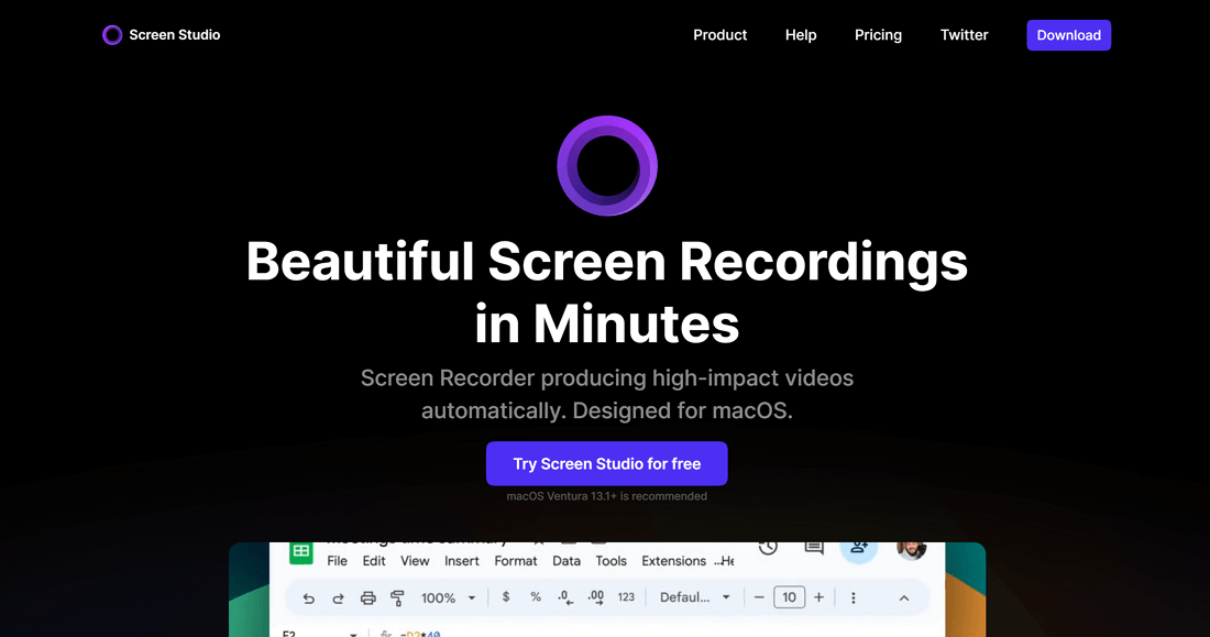
The hero section grabs your attention with the headline “Beautiful screen recordings in minutes” and a clear CTA to try for free. Simple and to the point. It gets the value proposition across and gets you to interact with the product.
As you scroll down the site has a dynamic embedded video that shows the software in action. This gives potential users a first look at the product. This feature demonstrates the product and keeps visitors visually engaged.
Despite being a one page website, Screen Studio covers everything a visitor might want to know including testimonials, pricing and features all laid out in an easy to navigate way.
The use of on brand visuals throughout the page gives you a sneak peek of the software which is great for users who are visual heavy when evaluating a product.
Why It Stands Out:
3. Neverland
The Neverland Agency website is a great example of how a one page website can be super immersive and engaging. As a creative experience agency Neverland shows off their UI design skills with a site that is both beautiful and functional.

The design is a lesson in how to make a single page site feel deep and layered, with attention to detail in every element, even the cursor which is a simple black dot that matches their brand.
The site is a storytelling experience, with visually striking images, parallax effects, and animations that take you on a journey through the brand and the team.
The site is structured to lead you on a journey, with bold and compelling narrative text that grabs you from the start.
The right hand extendable menu is a clever design choice, you can navigate if you want to, but the real magic of the site is experienced by scrolling through the content in the intended order.
This creates a super engaging experience that feels both intuitive and creative, just like the brand.
Why It Stands Out:
The ONCE - Writebook website is a great example of how a one page site can be informative and engaging. It’s targeted at writers and authors looking to publish their books online.
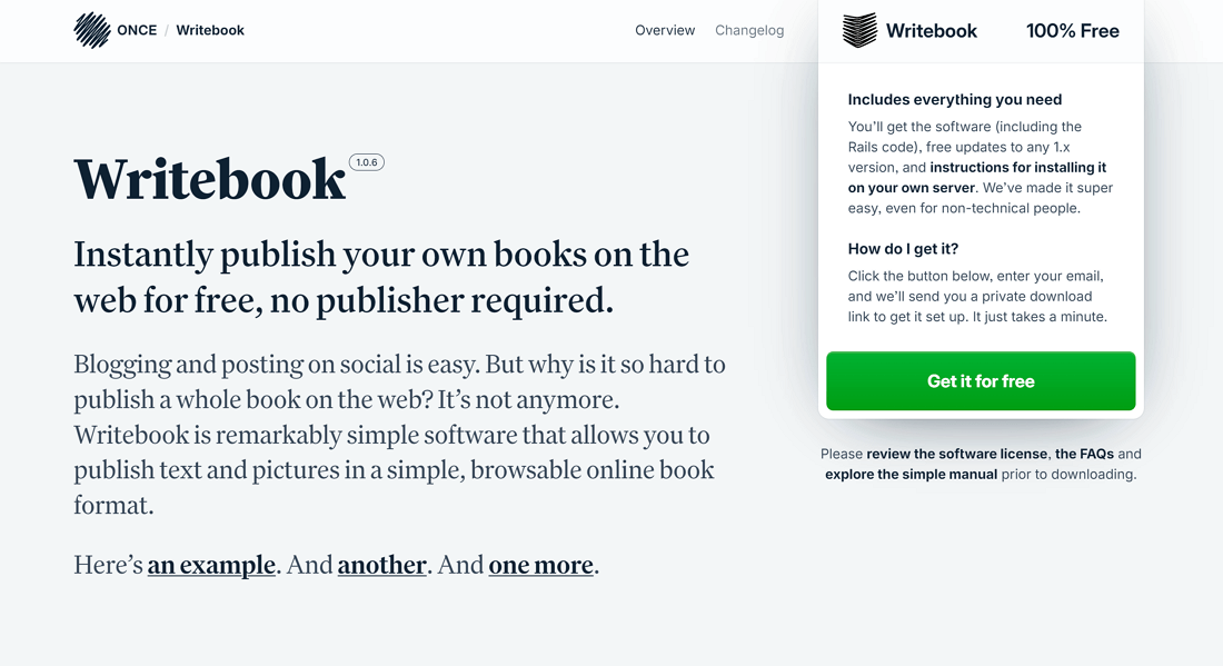
As such, it’s text heavy which is perfect for the audience, delivering loads of information in a straightforward and concise way. This will appeal to authors who value clarity and directness.
As you scroll through the site, you’re presented with screenshot visuals that support the text, so you can see what the service offers.
There’s also a FAQs section to answer common questions and concerns which adds to the overall usefulness of the page.
The design is clean and fluff free, just delivering the essential information without any distractions.
Why It Stands Out:
The Artone Studio website is a one page website that showcases the creative studio’s portfolio and is both fun to browse and interactive.
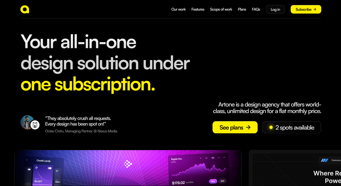
It uses sliders and pop-ups so you can dive into project details without leaving the page. This keeps you engaged and makes navigation super smooth.
As you scroll down, you’ll see a carousel gallery with high res images that show the studio’s services in action.
The gallery is visually driven and a great way to show their work. The site is full of animations and design elements that reflect the studio’s expertise.
Why It Stands Out:
6. Apple Plug
The Apple Plug site is a one page website that uses a product focused design to hook the user.
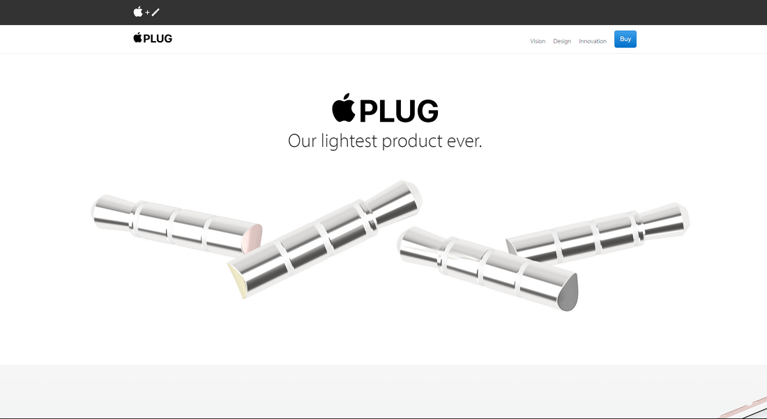
It looks like the original Apple site so you feel a sense of familiarity and trust. It uses a clean design with big visuals that show off the product.
You can either scroll or use the top menu to navigate to different sections.
The copy is no nonsense, focusing on just the features and benefits of the product. Visitors can quickly get what Apple Plug offers.
At the end of the page, a sign up for the email newsletter is provided so visitors have a clear call to action and a way to stay in touch with the brand.
Why It Stands Out:
The We Ain’t Plastic website is another one page portfolio website and is a great example for those that prefer simplicity.
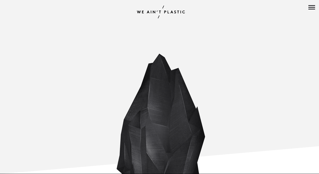
Full screen visuals and design elements pull you in and showcase the artists work in a really cool way.
The layout keeps you engaged as you scroll through the content, the black and white design sets a professional tone that matches the portfolio’s creative focus.
Icons are used to highlight the artist's strengths and services so potential clients can quickly understand what the portfolio offers.
The “Work” section is particularly great. You can view different projects and click to expand each one into a full page display on the same page.
This interactive approach not only shows off the artist's skills but adds an element of fun and surprise to the browsing experience.
Why It Stands Out:
8. Flayks
The Flayks website is a great example of how a one page can transport you into an artistic experience.
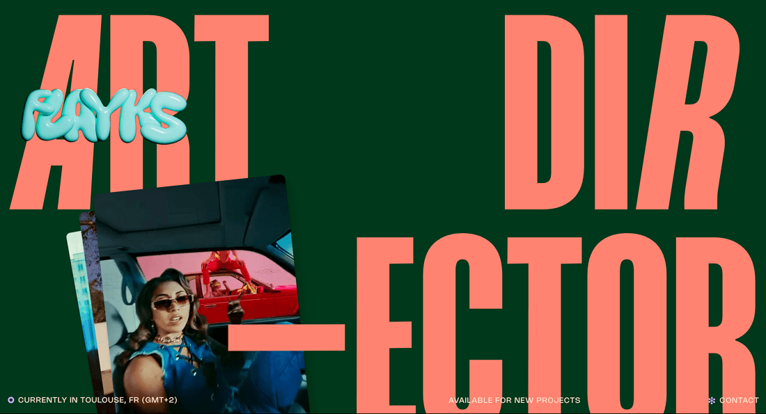
This is a dynamic site with scrolling effects and interactive elements that’s visually interesting from start to finish.
The design is intentionally hectic as the designer wanted to “challenge the boundaries of digital design,” what he does with his own work. This is perfect for an artist’s portfolio, it’s a unique experience that will resonate with his audience.
The interactive elements like carousel videos and drag and scroll features for horizontal scrolling allow you to explore the online portfolio in a way that feels more like an artistic journey than a website.
Each section is packed with dynamic icons and visuals that showcase the services in a creative and unconventional way.
Why It Stands Out:
9. Robot Genius
Robot Genius is a great example of how a one page website can communicate a brand and show off their work in a beautiful way using videos.

As a tech video and film company, their expertise is obvious as soon as you land on the site.
The above the fold section is a full screen background video with changing hero text that explains what they do. The brand logo is in the middle of the screen and bounces occasionally.
As you scroll down the site transitions into a portfolio of their work, displayed via embedded videos. This is simple yet effective, they let the content be the hero, not the words.
If you want to see more you can click on the links to go to the external sites where the final projects are hosted. This is a great example of how a one page website can be used in the film industry where visual storytelling is everything.
Why It Stands Out:
10. Pillowtalk
Pillow Talk is a one page website that is focused on promoting the beta launch of a new private journaling app.

It nails the brand messaging — relaxation, calm, privacy — through the engaging use of visuals and an effective pastel-based color scheme.
The above the fold section has changing photos with hero text that has a shimmering or wavy effect. This visual approach matches the emotional tone of the brand and sets the tone for the whole site.
As you scroll down the site introduces the app features, each one with visuals that are informative and on brand. The "How our community is using it" section stands out with a rolling carousel of user testimonials, which adds credibility and connects with new users.
The whole site is visually cohesive, every image and element reinforcing the feeling of relaxation and calm that Pillow Talk wants to evoke.
Why It Stands Out:
Key Takeaways for your One Page Website
One page websites are a great way to get your message across in a concise and visually appealing way.
Whether you’re selling a product, showcasing a portfolio or introducing a service, focusing on clean design, strong visuals and strategic content will make your one page website both effective and memorable.
What to keep in mind for your one page website:

Learn What's Working Now from 120+ Top Landing Pages in our FREE Guide
Get Access to 120+ Landing Page Swipes from Creators, Digital Marketers and Experts + insights and steps to boost your landing page conversions.
Ready to experience the OptimizePress difference?
OptimizePress is the leading funnel builder and landing page builder that is affordable and designed for solopreneurs and founders who need to get their pages live fast.
14 day money back guarantee


