

Four words, three words, one word? How many words should the perfect call to action button include?
The primary focus of a successful “call to action” is not about how many words you use.
It is more about using words that resonate with your lead magnet or sales offer and switching your target audience into taking action and converting them into a new lead or sale.
One issue people had before OptimizePress came to market was the ability to design attractive buttons. Designers were already aware of this, and even when the first version of OptimizePress was released it shook up the marketing world by creating powerful, bright, eye-catching buttons.
These classic marketing buttons were seen everywhere and became an essential part of every sales page.

Now with the latest version of OptimizePress, it’s a breeze creating stunning high converting buttons in only a few clicks.
You can easily clone buttons, edit text, font styles, letter spacing, but you must be aware there are many other factors that influence the conversion rate of your call to action button.
The ability to clone buttons makes it easy to test layouts and place buttons in multiple areas of you pages.

Successful buttons have a combination of the following elements.
- Font Style
- Space Balance
- Size & Colour Tone
- Informative
- Language
- Urgency
What is a Call To Acton
The term “call to action” is a little vague when used in articles, so to be as clear as possible a call to action is “something that makes the site visitor take action or do something”. It is also referred to simply as CTA.
The CTA could be:
- Download a product
- Add item to cart
- Request information
- Trial offers
- Learn more
- Complete a survey
Our landing page guide covers how to build a good call to action area on your landing pages but read on to learn how you can use these other elements to encourage more clicks on your buttons.
Font Style
The font on your buttons is a major factor in making your buttons blend with the overall design. Always keep your button font a similar style to all the other fonts on your page. Don’t go to wild and use crazy handwritten fonts if they not used elsewhere.
Remember OptimizePress includes some beautiful default fonts…

…and some of the Google fonts:

Just because they are there it doesn’t mean you should always use them all on one page.
Balance The Surrounding Space
You want your call to action buttons to stand out on the page. We recommend using white space on your landing pages, so the important elements have room to breath and take center stage.
The size of the buttons must balance well with the space around it.
Look how ActiveCampign let these ‘Learn More‘ buttons have space around them. They stand out under the content and clearly allow the user to make a choice.

However…. that said if you were building a shopping cart styled page you might not want to add lots of space around the ‘Add to cart’ button. This product page from Zappos shows no space around the buttons and they still stand out.

Colour & Size
The colour and size of your button will have an impact on the conversion rate. A stupidly big button will be overwhelming and distract from the offer. A button that is too small will get lost in the content of the page. The wrong colour will clash on the page and possibly change the mode of the visitor.
You button colour tone must blend well with the page design and font. Along with the size, it must all balance well with the text, colour and offer around it.
Evernote do this very well.
They actually don’t use much spacing but the call to action button is beautifully designed and positioned perfectly within the offer making it stand out in the surrounding content.

Download our colour emotion guide if you need help deciding what colours trigger different emotions for your visitors.
Be Informative
The call to action button should clearly explain what will happen next or what the user will receive after clicking the button. This could be in the main button text or even another line of text above or below the primary call to action.
Shopify makes it very clear what will happen when you click this button.

The OptimizePress button generator has a subtext feature built into it. This can work wonders if you are trying to entice your site visitors to follow through and take action.

The extra information you provide must add to the overall user experience. It may describe more about what will happen, what they receive or even pricing details but remember the main call to action text must be more prominent.
Informative text or subtext is most commonly used on the trial buttons when explaining how many days a trial is, like this Basecamp example:

Informative text could also be used to mix up the copy and make a clearer call to action like this example from ContentVerve.
Control page button text: Get your membership
Treatment page button text: Find you gym & get membership
It’s amazing how much simple changes can increase conversions.

Language
The language you use in your message will also play a vital role in the conversion process.
If you choose to use action orientated words to encourage clicks, try testing multiple words across a couple of different pages. You may also choose to get personal with your call to action text and clearly describe the exact offer using words and phrases your audience know.
We are always reinforcing the benefits of split testing OptimizePress landing pages, and this example shows how the words Get and Order can make a difference of 14% increase in conversions.
All from simply changing the one words used on the call to action button.

Add Some Urgency
When testing your landing pages, you may want to try adding some urgency into your button text.
If your landing page doesn’t create a sense of urgency using countdown timers you can try the subtext option and include a text line with a time limit phrase or end date.

This urgency text could fall under our extra information section as your are adding to the user experience. As urgency is a powerful factor for increasing conversions on any landing page we feel is deserved it’s own place on any CTA button.
Call To Action Buttons For You
So now you have some tips for creating higher converting call to action buttons we have given you a head start by building a template that includes a bunch of call to action buttons for you to use on your pages.
The template has over 100 buttons ready to use with icon fonts.

How To Install The Template
Note this template will only work in OptimizePress.
Step 1 – Download the template
Simply enter you email below and we’ll send you the template. Do NOT unzip the file.
Leave it zipped up ready for importing into your OptimizePress site.
[optin_box style=”24″ alignment=”center” email_field=”inf_field_Email” email_default=”Enter your email address” email_order=”1″ integration_type=”infusionsoft” double_optin=”Y” list=”150″ name_field=”inf_field_FirstName” name_default=”Enter your first name” name_order=”0″ name_required=”Y” action_page=”https://zf137.infusionsoft.com/app/form/process/ba6bb636aded69425684e72b686c8bff”][optin_box_hidden][/optin_box_hidden][optin_box_field name=”headline”]Subscribe Below to Download the Call to Action Buttons Template[/optin_box_field][optin_box_field name=”paragraph”]PHA+TG9yZW0gaXBzdW0gZG9sb3Igc2l0IGFtZXQsIGNvbnNlY3RldHVyIGFkaXBpc2NpbmcgZWxpdC4gRG9uZWMgdmVsIG51bmMgbm9uIGxhY3VzIHZlbmVuYXRpcyBjb21tb2RvLjwvcD4K[/optin_box_field][optin_box_field name=”privacy”]We value your privacy and would never spam you[/optin_box_field][optin_box_field name=”top_color”]undefined[/optin_box_field][optin_box_button type=”0″ button_below=”Y”]Get Instant Access![/optin_box_button] [/optin_box]
Step 2
Navigate to the Create New Page area.

Step 3
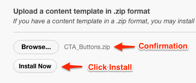
Browse and choose the CTA_Buttons.zip template from the location you saved it on your computer.
You will see confirmation when the zip file is ready to be installed.
Next, click the install button.
Once the template is installed you will see a green confirmation bar like this.

Step 4
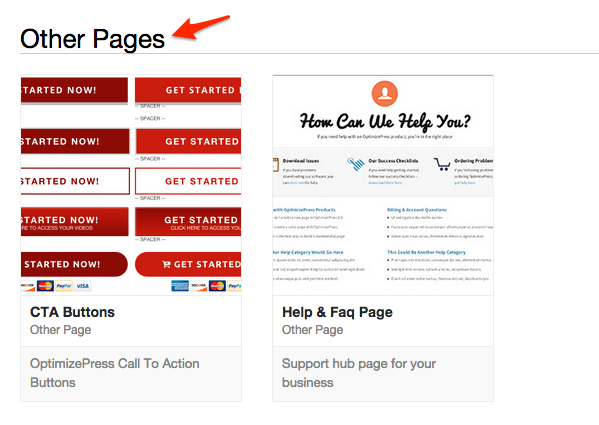
Scroll down to Other Pages and you will see the CTA Buttons template ready to use.
How To Use The Buttons
Step 1
To use our button template all you need to do is drag any button into the empty rows provided.
Click the Copy Row button. When you click this copy button another icon (paste) appears on the right hand side between the move and delete row buttons.
You watch how to use the Copy & Paste Row in this video.

Step 2
Now on the same site, open the LiveEditor for the page you want the button on and click the Paste Row button then delete the 1. & 2. text elements and you now have the button ready to use.

That’s it! You now have over 100 buttons to use!
[feature_box_creator style=”1″ width=”” top_margin=”” bottom_margin=”” top_padding=”” right_padding=”” bottom_padding=”” left_padding=”” alignment=”center” bg_color=”#F3F3F3″ bg_color_end=”” border_color=”#CBD2D6″ border_weight=”1″ border_radius=”” border_style=”dotted” ]
Tell Us What You Think – Please Comment Below!
As always we love to hear your comments or questions. What text converts the highest on you own call to action buttons?
[/feature_box_creator]


