The 10 Best Pricing Page Examples That Convert

Last Updated: September 14, 2026 by James Dyson | Reviewed by: James Dyson
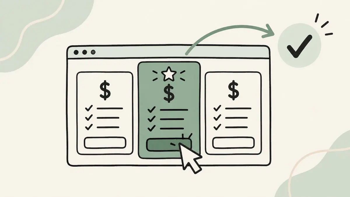
Best Pricing Page Examples

What makes a pricing page irresistible enough to turn visitors into customers?

A well-crafted pricing page isn’t just about numbers – it’s the conversion bridge between potential leads and loyal customers. The right design can build trust, communicate value, and ultimately drive more sales.

Feeling like you need to revamp your pricing page or draw inspiration from the best out there?

In this article, we’ll explore 10 of the best pricing page examples that excel in design, clarity, and persuasion. In no time, you’ll be boosting conversion rates too.

What is a Pricing Page?

A pricing page is a page on your website where you show the cost of your products or services along with the features and benefits of each pricing tier.

Its main job is to inform potential customers of the options available in your pricing model and guide them through the decision making process for buying.

Pricing pages are conversion powerhouses because they combine clarity with design.
By addressing customer objections (think: cost justification and value comparison) and simplifying the decision making process, they are a key touchpoint in the sales funnel.

A good pricing page goes beyond showing price points. It also builds trust, transparency and value in an effort to move the user to buy from your sales team.

Landing Page Lookbook Offer

Learn What's Working Now from 120+ Top Landing Pages in our FREE Guide

Get Access to 120+ Landing Page Swipes from Creators, Digital Marketers and Experts + insights and steps to boost your landing page conversions.

What Makes a Great Pricing Page?

A great pricing page is all about balancing aesthetics, clarity and persuasive design to guide the user to a confident decision.

Here are the key elements that make up a good pricing page:

Clarity in Pricing: Transparency is key. Use plain language and no hidden fees or jargon. This builds trust and lets the user know exactly what they get.
Intuitive Layout: A clean design helps the user compare your pricing plan tiers and features. Use tables, contrasting colors or bold fonts to highlight the differences.
Strong Value Proposition: Clearly communicate what each pricing tier is worth. Use bullet points or visuals to show the benefits and help the user know why it’s worth the money.

The best pricing pages have all these elements and can encourage conversions by informing and motivating the user to act.

Common Pricing Page Mistakes to Avoid

Even the most well-intentioned pricing pages can fail to convert if they fall into these common pitfalls. Here’s what to watch out for:

Overwhelming Users with Too Many Options: Providing too many pricing tiers or complex feature comparisons can lead to decision paralysis. Keep your different pricing options clear and concise, guiding users toward a choice.
Hiding Costs or Crucial Information: Avoid burying fees, trial conditions, or extra charges in fine print. Lack of transparency erodes trust and increases bounce rates.
Unclear or Weak CTAs: A generic or poorly positioned call-to-action like “Click Here” lacks motivation. Use actionable and benefit-driven phrases like “Start Your Free Trial” or “Choose Your Plan.”
Failing to Highlight Value: Simply listing prices without emphasizing what the customer will gain (e.g., cost savings, productivity boosts, or exclusivity) misses the opportunity to make your page persuasive.
Overloading with Jargon: Using overly technical or niche language can confuse visitors. Speak in terms your target audience will easily understand.
Lack of Social Proof: Omitting reviews, case studies, or testimonials makes it harder for potential customers to trust your offerings.

By avoiding these mistakes, you ensure your pricing page not only provides comprehensive information on your subscription plans and refund policy but also drives action and builds confidence in your brand.

Best Pricing Page Examples Across Industries

OptimizePress takes our top spot for bringing together the essentials of an effective pricing page: clear choices, transparent billing, and reasons to buy. Its WordPress platform’s pricing page helps visitors understand both what they’ll pay and which plan fits their business.

OptimizePress Pricing - WordPress Website Funnel Builder

Why it Works:

Plans Built Around Customer Needs: Launch, Scale, and Elevate connect each package to a clear use case, from collecting leads to building funnels and serving clients. This helps visitors identify a suitable starting point.
Transparent Annual Pricing: Each plan displays its annual price, renewal amount, and tax exclusion together. Visitors can understand the ongoing commitment before moving to checkout.
Guided Comparison: The “Most Popular” label draws attention to Scale, while concise feature summaries make the options easy to scan. A detailed comparison further down supports visitors who need more information.
Reassurance Before Purchase: Customer testimonials, review badges, and a 14-day money-back guarantee address common buying concerns. Clear “Get Started” buttons provide a straightforward next step.

OptimizePress earns first place for how these elements work together. For businesses looking to make their pricing easier to understand and act on, it offers the strongest overall model to follow.

MasterClass delivers a masterful pricing page by focusing on the emotional value of its offerings and strategic upselling techniques.

Masterclass - Pricing page examples

Why it Works:

Annual Membership Focus: Encourages users to commit to annual plans by framing them as the most value-driven choice. The plans are differentiated by the number of devices allowed, simplifying decision-making while nudging toward higher-tier options.
Easy Accessibility Features: Clear descriptions of accessibility across multiple devices and offline viewing reinforce the value proposition. Users can easily envision how the service integrates into their lifestyle.
Minimalistic and Elegant Design: The design is sleek and distraction-free. Pricing details are clearly laid out, with subtle callouts like “Best Value” drawing attention to preferred options.
Emphasis on Value Over Price: The page reminds the users of the exclusivity and quality of its lessons, priming users to see the subscription as an investment in learning from the best, rather than just another expense.

By combining emotional appeal, clarity, and strategic layout, MasterClass’s pricing page effectively converts browsers into committed learners.

If you’re looking for examples of SaaS pricing pages that stand out, Basecamp’s is known for its radical simplicity and transparency, which makes it an excellent example of an effective pricing strategy too.

Basecamp - Pricing page examples

Why It Works:

Simplicity and Clarity: The page features only two plans, drastically reducing decision fatigue. The clear, simple choices are presented without overwhelming users with endless tiers or options.
Transparency: The page showcases total transparency by clearly listing everything that comes with each plan. There are no hidden fees or complicated add-ons. This builds trust and helps eliminate any confusion or uncertainty about pricing.
Focus on Value: Rather than getting bogged down by unnecessary details, the pricing page emphasizes how the product can help teams manage projects and collaborate more effectively.
Minimal Tables and Comparisons: Each plan’s features and benefits are presented in a concise and easy-to-read manner, making it clear what users get for their money.

Basecamp’s minimalist approach, clear structure, and focus on value and simplicity make it an excellent example of a high-converting pricing page that builds trust and reduces confusion.

Milena Alexandrova's pricing page is an excellent example of how to combine professionalism with creativity in a freelancer’s pricing structure while converting prospects.

Pricing page - Milena

Why It Works:

Creative Yet Professional Design: The page balances creativity and professionalism, reflecting the artist’s brand identity. Gradient-colored cards break up the different service packages, visually distinguishing each option while maintaining a cohesive, clean pricing page design that doesn’t overwhelm the user.
Clear Breakdown of Services: Each service category is detailed with breakdowns of what’s included in each package. This transparency gives potential clients a clear understanding of the scope of work they’ll receive, ensuring there are no surprises when it comes to deliverables.
Integrated FAQs and Add-On Options: Including a FAQ section directly on the pricing page helps address common concerns and objections right away, which can significantly reduce friction in the decision-making process. Potential clients can easily find answers to questions about the services and pricing, which encourages them to take action sooner.
Visual Hierarchy: The design uses visual hierarchy effectively, guiding the user’s eyes through the page. The use of gradient colors and well-placed text makes it easy to compare different packages at a glance, making sure users don’t feel lost or overwhelmed by too much information.

Milena Alexandrova’s pricing page is an excellent model for freelancers and small businesses to follow as it balances creativity and professionalism while maintaining clarity and transparency.

5. Ramp

This SaaS pricing page stands out due to its strategic simplicity and clear communication of its corporate payment offerings.

Pricing page - Ramp

Why It Works:

Simple, Transparent Pricing: Ramp’s pricing page opts for simplicity by offering a clear view of its pricing tiers. The options are displayed in a simple table format that makes it easy for visitors to compare features without feeling overwhelmed.
Clear Value Propositions: The page does an excellent job of showcasing Ramp's value proposition with bullet points highlighting the main benefits of each plan. Whether it’s the focus on expense management, employee credit cards, or spend analysis, Ramp makes it clear how the service can help businesses save money and streamline processes.
Highlighting Key Features and Benefits: The pricing page includes feature comparison tables that focus on the key functionalities offered at each tier, allowing users to understand exactly what they will gain with each pricing option.
Free Trial and CTA: Emphasis on the free trial option. This removes any friction for new users who might hesitate to commit immediately. The strong CTA encourages visitors to get started with a free trial, which is essential for businesses in SaaS or B2B space where users often need to test a product before fully committing.

Ramp’s pricing page highlights the value of the service, allows for easy comparisons, and emphasizes low-risk options like free trials, all while maintaining a user-friendly pricing page design that doesn’t overwhelm visitors.

Screen Studio’s pricing page communicates its two plans in a straightforward manner while highlighting the features and benefits of the tool.

Pricing page - Screen studio

Why It Works:

Clear Pricing Structure: The pricing page adopts a clean, transparent layout, which makes it easy for visitors to immediately see the available plans and their corresponding features. The plans are clearly outlined, with simple distinctions between what each tier offers.
Tailored Options: Screen Studio offers two plans based on either a monthly payment structure or “one payment for a lifetime plan” model, giving users the power to choose what best suits them depending on their usage frequency.
Smartly Done Visuals: The design and layout of the page are visually engaging without being overwhelming. With bold typography and simple, easy-to-read sections, the user can easily navigate the page without any distractions.
Concise and Actionable Copy: The copy on the page focuses on delivering value without fluff. It emphasizes the key benefits of using Screen Studio’s services, directly correlating the features to user needs.

Overall, Screen Studio's pricing page effectively combines clear communication, trust-building, and user-friendly design, making it easy for visitors to understand the value of the product and take the next step in their customer journey.

Homerun's pricing page is a masterclass in combining aesthetics with functionality within the HR solutions niche.

Homerun - Pricing page examples

Why It Works:

Engaging Visual Design: Homerun’s pricing page uses a sleek and modern design that reflects the creative industry it caters to. The clean layout with clear sections for different plans ensures the information is digestible without overwhelming the visitor.
Showcasing Value: Each pricing tier is presented with its features and benefits clearly outlined, helping users quickly understand what they are paying for. Homerun uses visuals and concise descriptions to emphasize how each plan supports businesses in hiring creatively.
Tailored Plan Options: Homerun’s pricing page includes flexible options that cater to different business sizes and needs. This personalized approach ensures users can find a plan that aligns with their specific requirements, whether they’re a small team or a larger organization.
Monthly vs. Annual Payment Toggle: The option to view and switch between the monthly price versus the annual price models offers more transparency. It also incentivizes the annual plan by offering a 15% discount.

Homerun’s user-friendly approach appeals to its target audience of hiring managers and HR teams who value aesthetics and simplicity.

8. Motion

The pricing page for Motion is designed with precision, highlighting its value proposition and addressing potential customer concerns effectively.

Pricing page - Motion

Why It Works:

Clear Pricing Table: Motion uses a straightforward pricing table that outlines the features of each plan. This transparency helps users easily compare options and understand what they are paying for, avoiding confusion.
Focus on ROI with Time-Saving Metrics: Below the pricing table, Motion highlights a compelling section about time saved using the platform. This includes data-driven claims about hours saved weekly, paired with a breakdown of how much that time equates to monetary value.
Dynamic Design: The page’s modern, responsive pricing page design reflects Motion’s focus on innovation. Elements like subtle animations and color-coded text headings keep the user engaged while navigating.
Smart CTAs: Prominent CTAs like "Try Motion for Free" are strategically placed throughout the page, encouraging visitors to take the next step without hesitation.

Motion’s pricing page effectively combines clarity, persuasive data points, and user-centric design to motivate sign-ups. The emphasis on time saved appeals to busy professionals looking for efficient solutions.

9. Proton

The Proton business pricing page is a great example of how to combine functionality and user-friendly pricing page design.

Pricing page - Proton

Why It Works:

Unified Product Suite Integration: The pricing table cleverly showcases various products (email, VPN, calendar, etc.) while emphasizing the Proton Suite, a combined offering. This encourages users to see the value in subscribing to the complete suite rather than individual products, making the offering more attractive.
Clear Tier Comparisons: The pricing tiers are visually distinct, with detailed feature breakdowns for each plan. This makes it easy for users to compare offerings and choose the one that best fits their needs.
Scalable Options for Businesses: The page highlights scalability, ensuring that businesses of all sizes feel catered to. Features like custom domain support and multiple user accounts are tailored to enterprise needs.
Global Focus: Proton positions itself as a global leader in secure communication. The language and structure of the pricing page reflect its international appeal, making it inclusive and accessible to a broader audience.

Proton’s pricing page effectively demonstrates value while encouraging businesses to invest in the full suite. By focusing on clarity, trust, and scalability, it appeals to a wide range of customers while emphasizing its commitment to privacy.

10. Fey

The Fey pricing page is a standout pre-launch offering, combining minimalism and dynamic design to captivate potential users.

Fey - Pricing page examples

Why It Works:

Unique Pre-Launch Simplicity: Fey uses a single pricing option—$30/month—eliminating the confusion of multiple tiers. This is a clever tactic, especially effective for early adopters, offering straightforward value.
Dynamic and Interactive Design: The page leverages animations and a slide-style scrolling approach to create a sense of fluidity and engagement. Each section appears as a natural continuation of the previous one, ensuring users stay intrigued as they explore the page.
Focused Messaging: The pre-launch pricing emphasizes exclusivity, encouraging visitors to act quickly to take advantage of this early offering. It appeals to innovators and early adopters seeking to be part of a product's journey.
Call-to-Action that Stands Out: A prominent call to action button encourages users to "Try it free," seamlessly guiding them to the next step. The simplicity and focus keep the decision-making process frictionless.

Fey’s pricing page delivers an engaging and visually appealing experience while maintaining simplicity. Its innovative pricing page design and exclusive pricing structure make it ideal for capturing the interest of early adopters.

Key takeaways

Crafting an effective pricing page is a strategic art that blends design, user psychology, and clear communication. Here's what you should keep in mind:

Highlight Value Over Cost: Use clear value propositions to show how your product addresses user needs rather than just focusing on price.
Keep Design Intuitive: Ensure a clean, responsive layout that simplifies decision-making and avoids overwhelming users.
Leverage Social Proof and Trust Signals: Integrate testimonials, user logos, or case studies to build credibility.
Transparent and Flexible Pricing Options: Make costs clear and provide multiple options (if applicable) to cater to diverse audiences.
Use Interactive and Dynamic Elements: Stimulating visuals, animations, or interactive components can guide users in a more engaging way through the page.

By applying these principles, your own pricing page can become a powerful tool to attract and convert users.

Landing Page Lookbook Offer

Learn What's Working Now from 120+ Top Landing Pages in our FREE Guide

Get Access to 120+ Landing Page Swipes from Creators, Digital Marketers and Experts + insights and steps to boost your landing page conversions.

Ready to experience the OptimizePress difference?

OptimizePress is the leading funnel builder and landing page builder that is affordable and designed for solopreneurs and founders who need to get their pages live fast.

14 day money back guarantee